Colors are like magic! They can make a poster pop, a logo remembered, or a brochure feel fun. When something is printed, colors are chosen to help people feel happy, calm, or excited. For example, red is often used to shout “SALE!” while blue can whisper “trust me.” Without colors, print materials would be boring!
Fun Fact: Bright colors are like loud voices—they grab attention fast!
Colors also act as silent communicators. A flyer for a yoga studio might use soft greens and blues to promote relaxation, while a sports drink ad might blast neon oranges and yellows to scream energy. This is why color matters—it’s not just pretty; it’s purposeful.
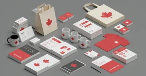
At eColor Media , colors are carefully selected to match a brand’s message. Whether it’s a business card, banner, or brochure, the right colors turn paper into powerful communication tools.
Color theory is like a rulebook for mixing and matching colors. It’s studied by artists and designers to know which colors work together. The color wheel (a rainbow circle) is used to explain:
Designers use this to avoid clashing colors (like socks that don’t match).
The color wheel isn’t just for kids’ art projects. It’s a designer’s best friend! Here’s how it works:
Understanding these rules ensures that a magazine spread doesn’t look like a toddler’s crayon box.
Colors can trick your brain! Here’s how:
This is called color psychology . It’s why your favorite soda can looks so tempting!
Color meanings change around the world!
Designers must research their audience to avoid accidental offense.
A children’s toy catalog might use bright pinks and blues, while a law firm’s brochure sticks to muted grays and navy. At eColor Media , we tailor colors to match your audience’s age, culture, and preferences.
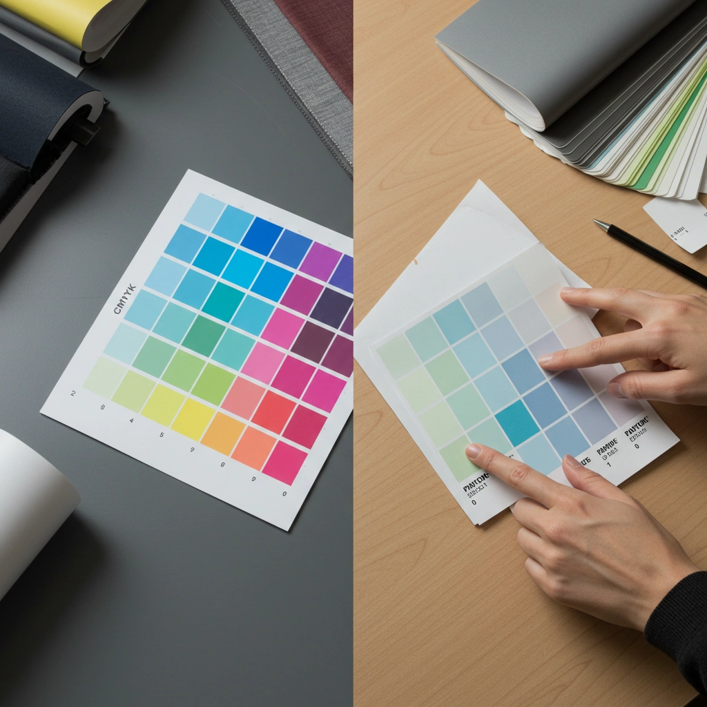
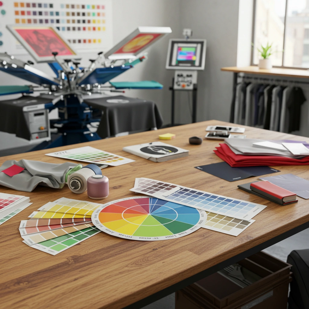
Printers use special codes to get colors just right. Two main systems are:
If a brand’s logo is bright red, Pantone is used. If a poster has a rainbow, CMYK is better.
CMYK stands for Cyan, Magenta, Yellow, and Key (black). These four inks are layered to create millions of colors. It’s perfect for photos or gradients but can struggle with vibrant shades like neon green.
Pantone colors are pre-mixed inks. They ensure consistency—your brand’s blue will look the same on a business card and a billboard. This is critical for logos, packaging, and marketing materials.
At eColor Media , we guide clients through this choice to ensure their prints look flawless every time.
Color schemes are like music playlists—they need to “harmonize.” Popular ones are:
These schemes are picked to make eyes happy, not tired.
Too many colors? Your design might look messy. Stick to 2–3 main colors. Use contrast to highlight key text, like a bold headline on a soft background.
Want readers to notice a phone number? Make it red! Need to downplay fine print? Use gray. Strategic color placement directs the eye exactly where you want it.
Here are tips for great-looking prints:
Pro Tip: Too much glitter ink? It might look messy. Less is more!
White space isn’t just “empty.” It gives the eyes a break. A cluttered flyer with no white space feels overwhelming. Leave room for colors to breathe.
Light gray text on a white background? Hard to read. Pair black text with a yellow background for clarity. Tools like WebAIM Contrast Checker help test readability.
Your business card, invoice, and brochure should all “speak the same color language.” At eColor Media , we create style guides to keep colors uniform across all materials.
Some combos are timeless:
For brands, pick colors that match their vibe. A bakery might use warm colors (like pink and brown), while a tech company might use cool colors (like silver and blue).
At eColor Media , we help brands choose palettes that reflect their personality. A playful brand gets bright colors; a serious one gets muted tones.
Avoid these fails:
Always double-check colors on a printed sample before mass printing!
Pastel text on a light background? Invisible. Use bold, high-contrast combos.
Screens use RGB colors, which look brighter than CMYK inks. Always convert files to CMYK before printing.
A rainbow of colors screams “amateur.” Stick to 2–3 main hues.
Designers use cool tools like:
These tools help ensure your brochure looks the same in real life as it does on-screen.
Try Coolors.co or Adobe Color to build schemes in seconds.
Adobe Creative Cloud users can sync palettes across Photoshop, Illustrator, and InDesign.
Pinterest boards and Dribbble are goldmines for color inspiration.
At eColor Media , we use these tools daily to create stunning, print-ready designs.
Colors are like a superhero cape for your brand. When picked right, they:
At eColor Media , we help brands pick perfect colors for print materials that stand out. From business cards to billboards, science meets art to make your message shine.
It grabs attention, shares messages, and makes brands memorable.
Blue, gray, and black are top choices for serious businesses.
Always use CMYK for print! RGB is for phones and computers.
Use Pantone guides and request a printed proof first.
Yes! Good colors make people stop, read, and remember.